Why not neglect your 404 page?
Anyone who thinks that a lost user is not so wild due to a faulty URL is wrong. Because in the worst case, a potential customer leaves the site. With a good 404 page, you can give your website visitor a few options to find exactly what they were originally looking for. Incidentally, the increasing user-friendliness of your website also has a positive effect on the ranking in the various search engines.
How to get the most out of your 404 error page with simple ideas
The biggest mistake you can make with a 404 page is not having a 404 page in the first place. The automatic forwarding to the home page for incorrect URLs is only a weak solution. Why? In both cases you do not help your visitor, which basically annoys him. Here are a few tips to get the most out of your error page:
State the error clearly
The clearer the error is formulated, the greater the understanding on the part of the user. Explain clearly what and most importantly why your visitor landed on the 404 error page and not on the landing page they wanted. A good example: “We’re sorry. The page could not be found. The address may have been misspelled or the page may no longer be available due to a reorganization of our website.”
Take the customer by the hand
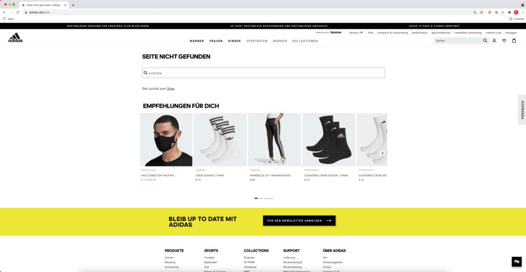
The work is not done with the error message alone. The customer then knows where he is, but not what he should do next to get a solution to his problem. Additional links can help here. For example, this could be a link list with the most helpful or most frequently accessed pages. Online shops often feature the most popular products or categories. If it is a website with a lot of important information, the link to the FAQ area can also be useful.
Better hits with a search form
Additional links are good, but a search form would be even better – here the customer can explicitly search the entire site for a specific term. The chance of success in offering exactly what the user is actually looking for is automatically many times higher. This is particularly useful for websites that are very large and contain a corresponding amount of information and subpages.
provide contact information
If the user still cannot find their way around your site, you can best give them the opportunity to contact you directly. For example by linking your phone number or email address.
Note the design
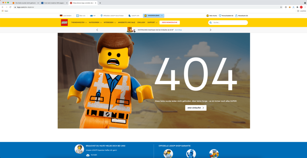
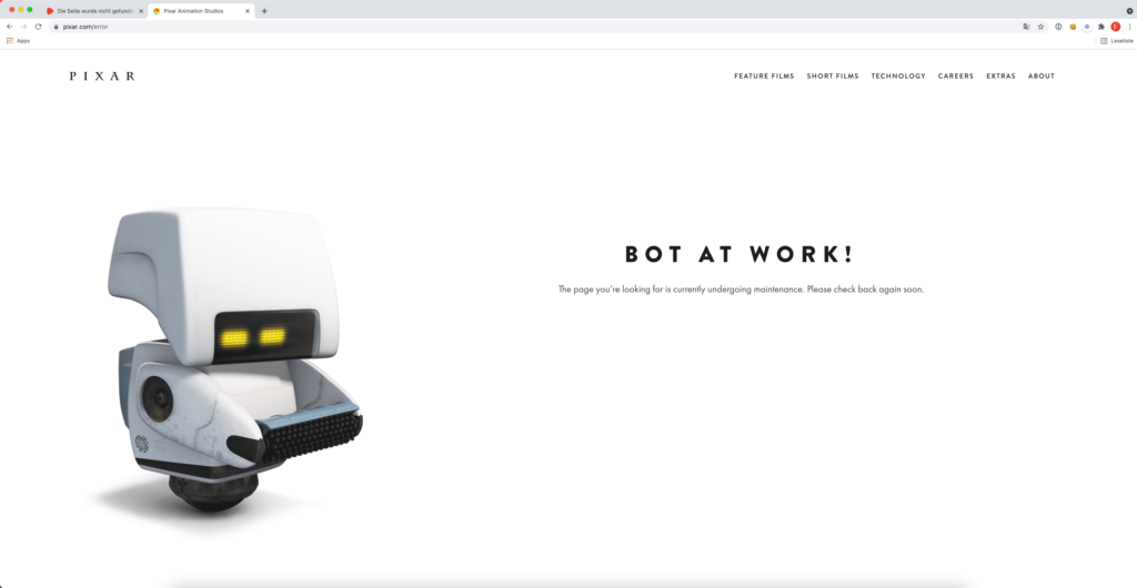
In many cases a simple list of links on a white background may be sufficient. But that’s not really inviting. That is why the design also plays an important role on a 404 page. On the one hand, it is of course important that the corporate design is retained so that the user does not feel lost on your site. Especially in online shops, the presentation of the categories or products should be designed in an appealing way, so that the willingness of a potential customer to click is increased and, in the best case, he also buys something from you in the shop.
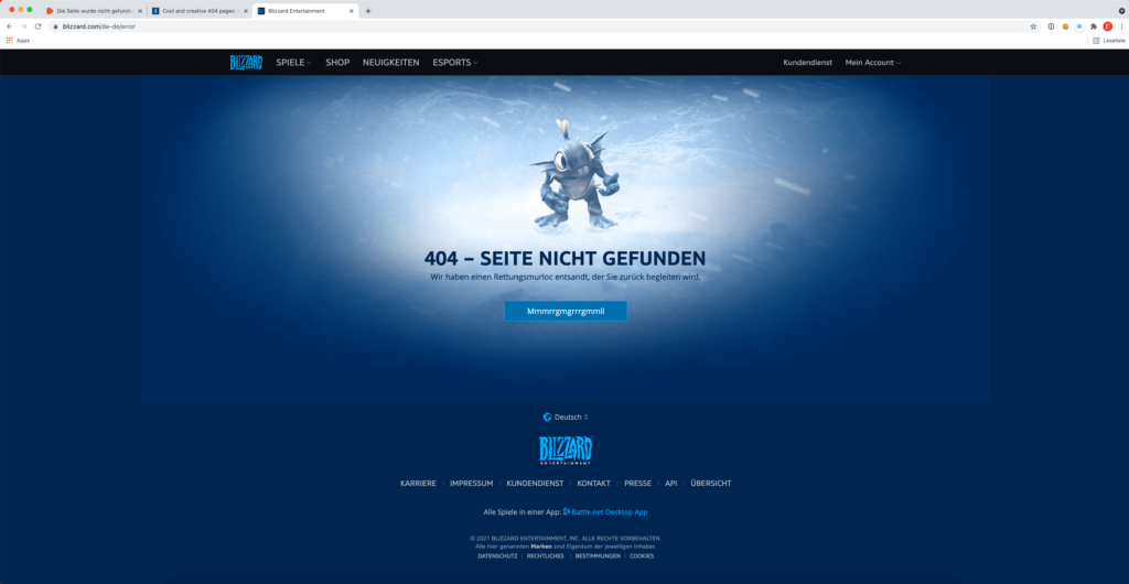
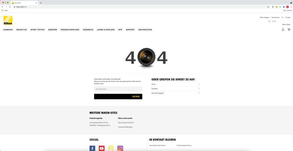
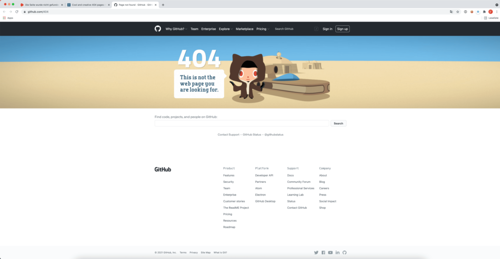
Some examples of good 404 pages from well-known companies
If you are looking for creative ideas for a good 404 page, please contact us by email. Simply write us your domain and what you think is the main task of your website. Or call us directly in our creative cell on Hafenstrasse.
